I mentioned in my review of Presentation Zen that I was looking for some input on how to structure my slides so that I could best leverage them in the studio. One of the other books I reached into for inspiration was Slide:ology. I had seen Nancy Duarte speak at the Pluralsight Author Summit and was intrigued by her views on presentations and storytelling. She comes from a design background and as a result the way that she lays out her slides and her books is different than someone like me who has grown up with technology and content production. I’ll fill the page. She’ll empty it. Neither is right but it does create for me some interesting contrast.
Having an Individual Conversation with a Thousand People at Once
The best speakers have a gift. That gift is the ability to have a thousand individual conversations at one time. It’s sort of like how Mona Lisa’s eyes seem to follow you as you walk around the room. It’s not literally true, of course. It is, however, something to see. Where you’re so enthralled with the presentation that the rest of the audience fades into the dark and you feel that you’re the only one that the presenter is talking to.
This is the power of the platform. It’s the ability for a speaker – with the right talent – to engage everyone all at once. When we’re designing our slides we need to design them with this point of view in mind. We’re not speaking to an audience of a thousand. We’re speaking with an audience of one – well, lots of audiences of one.
I don’t mean this from the perspective that you don’t have to pay attention to the slides. Actually, quite the opposite. You have to focus the content on the slides so that people aren’t distracted. You don’t want one of the members of the audience going down a rabbit trail that the rest don’t go on. You’ll need everyone on the same page. They’ll all need to understand where you are if they’re going to follow you as you hop from one topic to another.

The Meaning of the Data
I was recently at a conference where a presenter decided to deliver a massive amount of data during his keynote. There were reams and reams of slides that talked about the changes in the industry and what might happen. What struck me – in addition to the fact that he wasn’t a very good presenter – was that the audience couldn’t make sense of what they were being shown.
If you’ve ever looked at survey data it is mind numbingly boring to look at question after question of answers trying to find some unexpected result. The same thing happens with audiences when you show them reams of data. They can’t make sense of it so they shut down and stop trying. You see what people want isn’t data. Sure you need the raw data but they want to know what the data means.
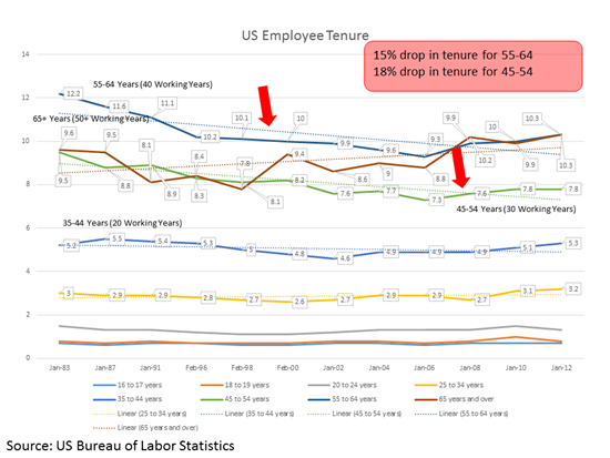
One view is that you’re tasked with walking up a standard knowledge management path and say that you’re transforming data into information, knowledge or wisdom. Another view is simply that you’re sharing your insights. As the presenter you’re showing what the data means. Take a look at this slide of mine on employee tenure:

I should say that this isn’t the best slide that I’ve ever done. However, it illustrates how to pull up the meaning. The context is this is all of the employee tenure data that the US Bureau of Labor Statistics had. It breaks tenure by age group. The tracking of the data didn’t mean much so I added trend lines to show whether the trends were up or down. Then for the two key age groups (55-64 and 45-54) I added arrows to their lines and a call out box that explained the values for the two key lines. For this slide I wanted the audience to realize that for the largest groups we had a downward trend for tenure – which means they’re retiring earlier. This slide fits into a deck on knowledge management and is part of the support for the need for knowledge management.
Here I showed the data and then added layers of meaning to it. That’s what we’re being implored to do – to add meaning to the data we deliver.
Elegance at the Essence of Design
We’ve all seen – or probably created – hacky solutions that work but they’re not the most elegant. Whether it’s stacking some papers under the projector to get it to line up or using a paper clip to eject a DVD from a computer, the solutions undeniably work but they don’t have the intentionality that we recognize in design. Good design finds elegant answers to the problems that it faces. Elegant answers seem to fit naturally and waste nothing. I vividly remember a conversation about how you would mechanically flip a soda can so that its opening was moved from the bottom (so it wouldn’t collect objects) to the top. In my head I could see these robots individually picking up cans and turning them over. What I couldn’t see is a railing system that flipped the cans over not unlike how a roller coaster rolls passengers over. It’s simple, efficient, and elegant.

Elegance is about having nothing wasted. Lean manufacturing strives for the lack of waste through continual refinement and removal of anything that doesn’t add value to the customer. However, this reductive process isn’t the same as creating elegance. There are seams between the different areas of consideration while doing the reduction.
Visual Consistency
Emerson said that “Foolish consistency is the hobgoblin of little minds.” However, we crave consistency. We look for patterns and we use those patterns to simplify the world around us. The simple fact of the matter is that our world is way too complicated and rich for our brains to process. We have to simplify our world through the recognition of patterns to take it all in. When we break consistency we force our students to process all of the visual elements individually instead of being able to process them as a unit.
A baby, for instance, when shown a set of dots moving in formation will diligently follow the dots around as they move. If one of the dots suddenly darts off in another direction the baby won’t follow it but instead will be confused. The baby – and adults – start processing the dots as a unit all moving together and when one dot breaks that pattern their approach to processing is interrupted. We do this grouping all the time with flocks of birds and anything that moves as a group. Even as adults when something breaks this pattern we’re confused.
This is why visual consistency – creating a repeatable pattern that can be followed – is so important. It allows us to reduce our cognitive load and process things more efficiently. So when you add an effect – a reflection, a 3D skew or rotation, you’re committing yourself to doing this for all of your graphics. While this is something that you can do – in larger presentations it can generate a large amount of work.
Experience
One tip – not necessarily from Slide:ology – is that the more you envelop yourself into the process of trying to understand design the more you’ll be able to inherently recognize good design when you see it. Perhaps Slide:ology can be that first step.


No comment yet, add your voice below!